Serene Neutrals, Textural Depth

Today we dive into neutral color palettes and texture pairings for calm sophistication, exploring how quiet hues and tactile layers create balanced rooms that breathe. Expect practical color psychology, material guidance, lighting insights, and lived stories that help you compose peaceful, enduring spaces you’ll love returning to, every day. Share your favorite neutral combinations, ask questions, and subscribe to keep receiving step-by-step ideas and designer-backed experiments that genuinely work in real homes, rentals, and evolving lifestyles.

The Quiet Power of Neutrals

Neutral palettes are not about absence; they are about intention, restraint, and clarity. When the eye rests on gentle values and consistent undertones, the nervous system follows, lowering visual noise and inviting slower attention. We’ll look at how carefully chosen shades support routines, how they complement cherished objects, and why calm backgrounds make life’s colorful moments feel more resonant and memorable.

Composing a Balanced Palette

Warm, Cool, and True Neutrals Explained

Warm neutrals include creams with buttery undertones, taupes with brown depth, and beiges touched by sand. Cool neutrals skew toward blue, green, or violet grays, suggesting fog and stone. True neutrals sit between, often reading sophisticated and architectural. Combine neighboring families rather than extremes to avoid temperature fights. Swatch in morning and late afternoon to test shifts; comfort often changes with the sun’s angle and seasonal daylight length.

Contrast Without Chaos: Value and Saturation

Calm sophistication thrives on gentle contrast. Start with a light base wall, introduce mid-tone upholstery for grounding, and add a deeper accent through wood, metal, or a single painted piece. Keep saturation low to moderate to avoid jittery edges, and let texture produce interest instead of loud color. A weighted rug, matte ceramics, and linen drapery supply quiet rhythm while preserving spaciousness and ease.

Sample Boards and Digital Swatches That Tell Truth

Gather paint cards, fabric snippets, flooring samples, and metal finishes on a portable board. Photograph them in different rooms and under artificial lighting. Digital mockups help, but real materials reveal sheen, weave, and shadow behavior. Record undertone notes and value ratings so decisions remain consistent when you’re shopping. Share your boards with us for feedback, or subscribe to receive printable checklists that streamline your sampling process.

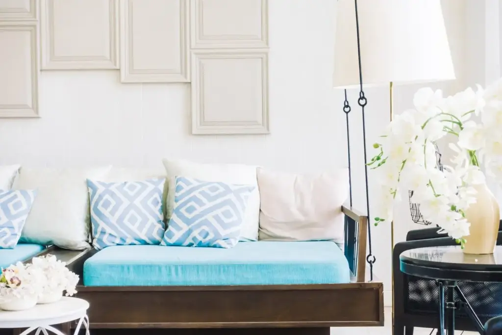
Texture as the Luxe Multiplier

Texture turns modest neutrals into elevated experiences. A palette of oat, stone, and bone becomes compelling when paired with nubby linen, brushed oak, honed marble, and hand-thrown clay. These surfaces slow the gaze, invite touch, and reward curiosity. We’ll explore tactile variety, scale, and proportion so the room feels richly composed without tipping into visual clutter or preciousness.

Light, Shadow, and Material Honesty

Neutrals reveal their finest qualities under honest lighting. You’ll see undertones shift, grain emerge, and surfaces soften as light travels. Mapping daylight and calibrating artificial sources ensures your palette and textures perform consistently from sunrise emails to midnight recipes. The right bulbs, shades, and dimmers can rescue a tricky paint choice, while thoughtful window treatments protect delicate finishes without sacrificing openness.

Room-by-Room Layering That Feels Effortless

Each space invites a slightly different balance of color and texture. The living room craves social warmth, the bedroom whispers privacy and softness, and the workspace prioritizes clarity. We’ll explore layouts and material sequences you can adapt quickly, even in rentals, with guidance that respects budgets, durability, and the constant evolution of families, hobbies, and daily rhythms.

Longevity, Care, and Sustainable Beauty

Calm sophistication endures when materials age gracefully and maintenance feels achievable. We’ll cover durable textiles, responsible sourcing, and rituals that keep neutral spaces fresh without constant shopping. Thoughtful choices reduce waste, protect indoor air, and let patina tell a story, ensuring your rooms remain welcoming, resilient, and personally meaningful year after year.
Kapakaletizaxahutuvo
Privacy Overview

This website uses cookies so that we can provide you with the best user experience possible. Cookie information is stored in your browser and performs functions such as recognising you when you return to our website and helping our team to understand which sections of the website you find most interesting and useful.